Category Trends (2009-2025)
The following visualizations provide a detailed breakdown of category performance on Kickstarter, showcasing trends in both funding amounts and the number of backers.
We have created two different charts for this purpose:
- Bar chart showing total amount in USD pledged (top) and average number of backers (bottom) by category.
- Scatterplot showing average percent funded vs. total number of backers, by year.
Bar Chart: Average Backer Count by Category
- Identify Top-Performing Categories: This bar chart ranks product categories by average backer count (green), highlighting which niches attract the most backers. By identifying categories with the highest backer engagement, you can focus your efforts on areas with proven audience support.
- Analyze Funding Dynamics: The chart compares average percent funded (blue) and average pledge amount (red) across categories, revealing trends in funding success and financial commitment. This can guide your strategy for setting funding goals and pledge levels.
- Spot High-Engagement Niches: Categories with high average backer counts often indicate strong community interest. Use this data to identify opportunities for visibility and collaboration in your project’s target market.
- Optimize Your Funding Strategy: By analyzing which categories attract the most backers and achieve high funding percentages, you can refine your project pitch and marketing to resonate with potential supporters.
- Compare Categories for Strategic Insights: See how different product categories perform relative to one another in terms of backer count, funding success, and average pledge amounts. This comparison helps assess competition and potential audience size for your project.
- Maximize Visibility and Financial Success: Use these insights to position your project in categories with the highest funding potential, ensuring it reaches the right audience and maximizes funding outcomes.

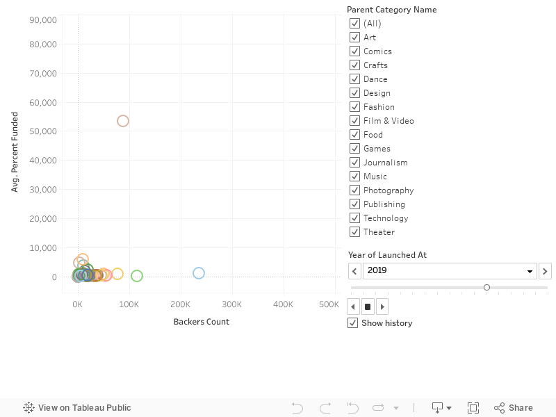
Scatterplot: Avg. % Funded vs. Number of Backers
- Visualize funding success: This scatterplot shows how the average percentage funded correlates with the number of backers across various categories, helping you identify which categories achieve the best funding outcomes.
- Explore category performance: Each point represents a specific category, giving you insights into how well projects perform in terms of funding and backer engagement.
- Analyze trends over time: Use the year filter to compare funding success and backer engagement for different time periods, uncovering shifts and long-term patterns.
- Focus on specific categories: Toggle the checkboxes to filter by parent categories and drill down into the data most relevant to your project.
- Refine your strategy: By identifying categories with the highest funding percentages and backer counts, you can plan your project for maximum impact and support.